Strategies for Creating Eye-Catching Calendars in Your Infographics

Creating an infographic can be a great way to tell a story, grow brand awareness and even increase sales. An effective strategy for creating compelling infographics is to utilize visual elements such as calendars. Calendars can add valuable context to your data, help you highlight key dates, or give viewers ideas on how they can use the information within the graphic.
Here are 10 tips on how to make eye-catching calendars in your infographics that will engage readers and drive action:
1. Choose the Right Calendar Type:
There are several types of calendars you can choose from including monthly, quarterly, yearly, daily and more. Each type of calendar has its own advantages depending on the duration of time you want to cover with your infographic and what information is most relevant. Make sure to pick the right calendar type for your infographic based on the data you want to present and how it will be used.
2. Consider Color:
Color can bring life and vibrancy to an otherwise dull or mundane infographic, so consider using color to highlight important dates or events that are represented within the graphic. You can also use color as a way of distinguishing different types of information within the calendar such as holidays, deadlines, sales promotions, etc. Just make sure that your chosen colors are not only visually appealing but also consistent with your brand message and identity.
3. Utilize Icons:
Icons are great tools for adding visual interest to any infographic and they can also be used to represent specific events or dates within a calendar. All infographics should use icons carefully and strategically, so consider using them sparingly to ensure they are not overwhelming the message of the graphic.
4. Leverage Shapes:
Shapes can be used in a variety of ways to add visual interest and context to your calendar infographic without detracting from the actual data being presented. For example, you could use circles or rectangles to call attention to special dates or use arrows or lines to show relationships between different entries within the calendar.
5. Make it Interactive:
By incorporating interactive elements into your calendar infographic, such as hover-over text boxes or clickable links, you can give viewers more information about the events or dates that are represented within the graphic. This can be a great way to engage viewers and give them a deeper understanding of the data being presented in the infographic.
6. Incorporate Animation:
Animation can be used to draw attention to specific elements within an infographic, such as key dates or events within a calendar. Animations can be simple, like having a date fade in or out, or more complex such as spinning arrows pointing towards certain entries. Just make sure that any animations you use don’t detract from the main message of your infographic.
7. Use Visual Hierarchy:
Creating visual hierarchy with your infographics is essential for ensuring that viewers will understand and retain the information being presented. When creating a calendar infographic, consider using different fonts and sizes for the dates or events that are the most important. This will help viewers quickly identify the key pieces of information from your calendar.
8. Include Temporal Context:
When presenting data within a calendar, it can be helpful to provide temporal context to explain why certain dates may be significant or how they relate to each other. For example, if you are showing sales figures over a period of time, include explanatory text that explains why certain months may have higher or lower numbers than others.
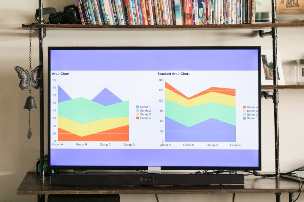
9. Use Charts & Graphs:
Charts and graphs can be great tools for visualizing numerical information within your infographics, especially when it comes to dates and time frames. They can be used to show trends in data or compare different sets of information within a single graphic.
10. Keep it Clean:
When creating any infographic, it’s important to keep the design clean and clutter free so that viewers can easily understand the message being conveyed. This is especially true for calendar infographics since they often include a lot of dates and events that can be difficult to distinguish from one another if they are presented in a cluttered manner. Make sure to use plenty of white space and limit the amount of text you include so that your calendar remains easy to read and comprehend.
Conclusion:
By following these simple tips, you should be able to create an effective calendar infographic that not only looks great but also conveys the information you’re trying to share in an easy-to-understand way. With a little bit of planning, you’ll be able to create an eye-catching calendar infographic that will get your message across and engage viewers.
